The Cadillac logo is one of the most recognizable emblems in the automotive industry. It symbolizes luxury, prestige, and American automotive excellence. Over its century-long history, the Cadillac emblem has undergone numerous transformations, each change reflecting the brand’s evolution and its dedication to innovation, style, and sophistication. In this article, we will take a deep dive into the history of the Cadillac logo, its various transformations, and the meaning behind its design elements.
The Origins of the Cadillac Brand
Before exploring the logo, it’s essential to understand the origins of the Cadillac brand itself. Cadillac was founded in 1902 by Henry Leland, who named the company after the French explorer Antoine Laumet de La Mothe, sieur de Cadillac. Cadillac was known for founding Detroit, which would later become the heart of the American automobile industry. Leland’s vision was to create a luxury car brand that represented the best of what America had to offer in terms of precision engineering and design.
The Early Cadillac Logo (1902)
The original Cadillac logo was based on the family crest of Antoine Laumet de Cadillac. The emblem was a testament to European nobility, emphasizing refinement, heritage, and grandeur. It was a complex and ornate design featuring a shield, crowns, and various symbols of power and prestige. The early emblem was rich with medieval European influences and showcased the brand’s high aspirations.
The original logo consisted of the following key elements:
- The Shield: Representing the crest of Antoine de La Mothe Cadillac, the shield symbolized strength and protection.
- The Crown: A representation of the noble lineage of the brand, connecting Cadillac to aristocratic ideals.
- Ducks and Merlettes: The early logo featured several ducks, often referred to as “merlettes,” symbolizing knights or soldiers.
- Color Scheme: The use of blue, red, and gold was prominent, with each color having its own symbolism. Blue denoted valor, red represented boldness, and gold symbolized wealth.
This emblem conveyed a sense of luxury and exclusivity from the very beginning, establishing Cadillac’s position as a premier automobile brand.
1920s-1940s: The Streamlined Crest
In the 1920s, Cadillac’s logo began to evolve to match the changing aesthetic trends. The automotive industry was rapidly modernizing, and Cadillac needed a logo that was cleaner and more streamlined. The crest remained central to the design, but it became more simplified, emphasizing clarity and elegance. The logo still retained elements of the original family crest, but it was more practical for branding purposes in an increasingly industrialized world.
During this period, Cadillac established itself as the go-to brand for luxury and innovation, and the logo played a significant role in reinforcing this image. The cars Cadillac produced were luxurious, powerful, and stylish, and the logo had to match this identity.
1950s-1960s: The Crest with Wings
The 1950s and 1960s were a golden age for Cadillac. The brand became synonymous with American success and luxury, and its cars were seen as status symbols. To reflect this, Cadillac introduced a version of its logo that featured the crest with wings, symbolizing speed, elegance, and forward momentum.
The wings added a sense of dynamism to the logo, reflecting the futuristic designs of Cadillac cars during this era. This was also the period when tailfins and chrome became popular in automotive design, and Cadillac’s logo reflected these stylistic choices. The wings extended from the sides of the crest, giving the impression that Cadillac cars were built for speed and adventure.
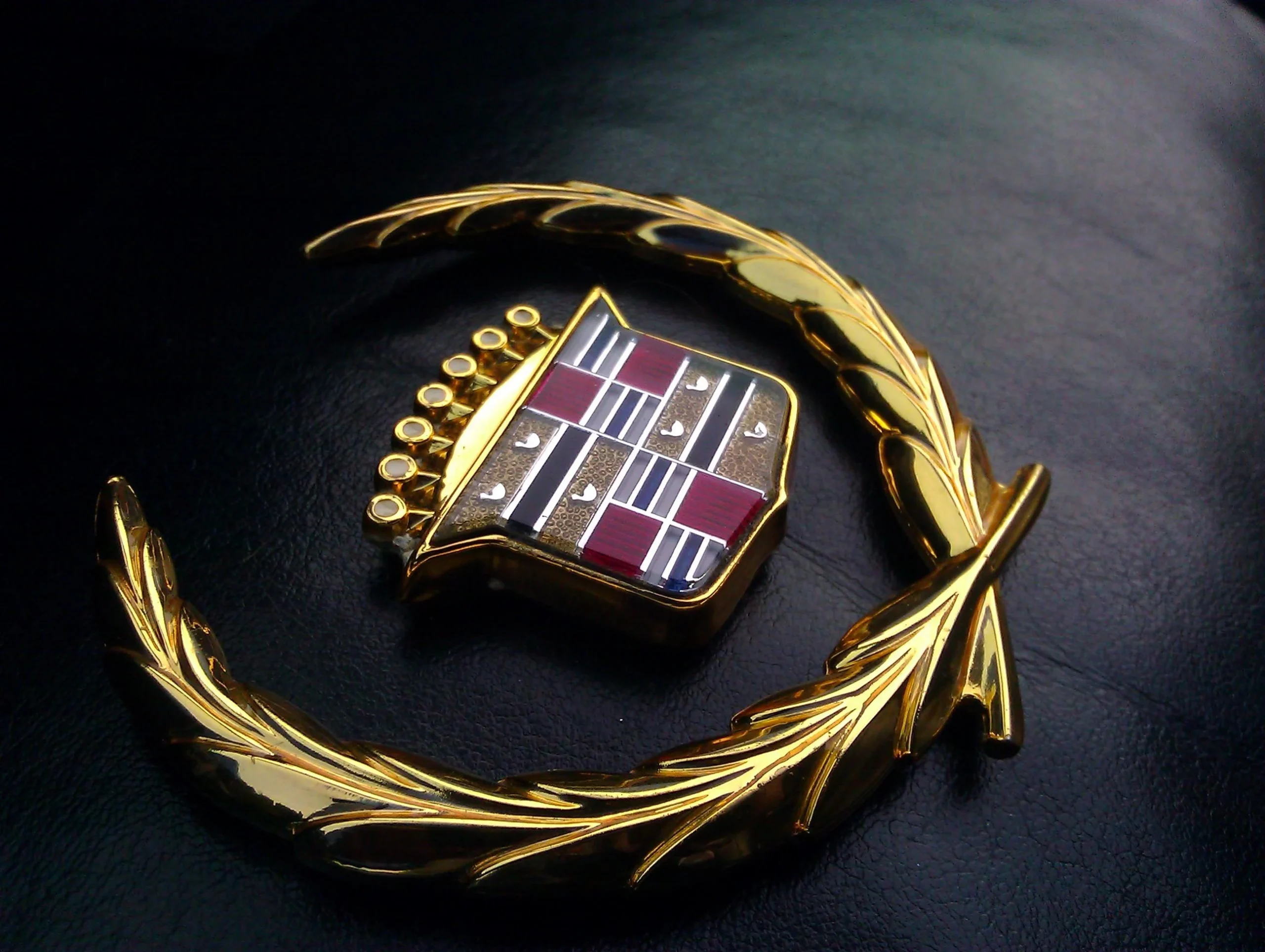
1970s: Simplification and the Wreath
By the 1970s, the Cadillac logo underwent another significant change. The brand adopted a more simplified and modern approach to the emblem, keeping the shield but introducing a wreath around it. This wreath, made of laurel leaves, symbolized victory and achievement, reinforcing Cadillac’s status as a leader in the luxury automobile market.
The simplified shield and the laurel wreath gave the logo a regal and polished look. It was during this time that Cadillac’s image as the “Standard of the World” was firmly entrenched in the minds of consumers. The logo’s new look was a testament to Cadillac’s continued innovation and excellence in automotive engineering.
1980s-1990s: Return to the Classic Crest
The 1980s and 1990s marked a return to Cadillac’s heritage with a revival of the classic crest, although it was more stylized and refined for the modern era. The crest remained the central element, but the design was more minimalist compared to the ornate logos of earlier decades.
This version of the logo reflected Cadillac’s focus on precision engineering and technological advancements during these years. The brand’s vehicles were known for their powerful engines, luxurious interiors, and cutting-edge features, and the logo represented the perfect blend of tradition and innovation.
2000s: A Modernized Crest
At the turn of the millennium, Cadillac introduced another iteration of its logo, aligning it with the brand’s bold new design direction. This modernized crest was sharper, more geometric, and more streamlined than ever before. It marked a departure from the traditional heraldic design and embraced a sleeker, more contemporary look.
Cadillac’s cars were also undergoing a design revolution, with models like the CTS and Escalade leading the charge in redefining the brand. The logo was a perfect match for these new vehicles, symbolizing Cadillac’s forward-thinking approach and its desire to remain relevant in a fast-changing industry.
2014: The Reimagined Crest
In 2014, Cadillac unveiled yet another update to its logo, this time removing the laurel wreath and focusing solely on the crest. This was one of the most significant changes to the logo in the brand’s history, signaling a major shift in Cadillac’s identity. By removing the wreath, Cadillac aimed to present itself as a modern luxury brand that was bold, confident, and no longer reliant on traditional symbols of power.
The updated crest was flatter and more minimalistic, which made it more versatile for modern digital applications. It was designed to look just as striking on the grille of a car as it did on a smartphone screen or a billboard. This move was part of Cadillac’s broader effort to appeal to a younger, more tech-savvy demographic.
Symbolism Behind the Cadillac Logo
The Cadillac logo is rich in symbolism, much of which is rooted in the heraldic traditions of European nobility. Each element of the logo has its own meaning, which has evolved over time. Here’s a breakdown of the key symbols in the logo:
- The Crest: The crest has always been the central element of the Cadillac logo, representing heritage, strength, and luxury. It serves as a reminder of Cadillac’s origins and its commitment to craftsmanship and excellence.
- The Crown: Although the crown has been removed in more recent versions of the logo, it once symbolized the noble lineage and prestige associated with the Cadillac brand.
- The Merlettes (Ducks): The merlettes, or stylized ducks, are a symbol of knightly prowess and military strength. They are a nod to the European origins of Antoine Laumet de Cadillac and represent courage and fortitude.
- The Laurel Wreath: The laurel wreath, used in the logo from the 1970s to 2014, symbolized victory and achievement. It reinforced Cadillac’s position as a leader in the luxury automotive market.
- Color Scheme: The use of colors like gold, red, and blue in the logo signifies wealth, courage, and valor, respectively. These colors have remained a constant part of the logo’s design over the years.
Conclusion
The Cadillac logo has undergone numerous transformations since its inception, each iteration reflecting the changing tastes and aspirations of the brand. From its early days as a symbol of European nobility to its modern, streamlined design, the Cadillac logo has always represented luxury, prestige, and innovation. Today, the logo stands as a testament to Cadillac’s rich history and its continued commitment to producing world-class luxury vehicles. With each new design, Cadillac reaffirms its place as an icon of American automotive excellence.